Interview and portrait by Judith Carnaby
September 2013
As I wandered around the busy maze of courtyards of the renovated factory complex in Köpenicker Straße, Cristóbal Schmal waved cheerfully to me out of a window on the fourth floor. An illustrator with years of experience working in graphic design, Cristóbal is originally from a coastal town in the north of Chile’s Atacama desert and has lived in Berlin for the last five years. His studio is a bright open space, shared with five other people working in the broad area of design, all with desks very cleanly and tidily arranged. Cristóbal’s desk is easy to spot, scattered with colourful tubes of paint and ink, and piles of cut paper with hand-printed and painted textures.
Following his decision to focus on illustration, the last six years have seen Cristóbal develop a wide portfolio working in editorial illustration, posters, and book covers. His works are vibrant and abstract, often using a limited colour palette, and geometric shapes and figures that look hand-cut, arranged in a very flat way that echoes early twentieth century collage.
Warming my Autumn-wind-chilled hands on a coffee, I talked with Cristóbal about his inspiration from the old masters, and looked at examples of his etchings, prints and digital illustrations.
——
Illustration for the Raum Italic Exhibition about Italian Design
Judith Carnaby: Tell me a bit about your art and design background. How did you get started in illustration and why are you now in Berlin?
Cristóbal Schmal: It was a little bit step by step. I studied graphic design in Valparaiso and then worked as a graphic designer, because in Chile 10 years ago illustration was not very interesting. I was working in a graphic design studio in Santiago but I wanted to leave because I wanted to learn and see something new, so I moved to Spain, first to Madrid and then to Barcelona. There I also worked as a graphic designer, but I started, little by little, to make illustrations for some of the projects. I worked there for six years, then in 2007 I changed to another studio where I was encouraged to do more illustration. That’s when I started to take it more seriously. Then I met my girlfriend; she’s German, and we moved together to Berlin, which is when I decided to focus just on illustration. The first year was not very easy, because of the language and to find clients, but it was a nice experience to try to meet people. And then the second year it went better, and right now it’s good.
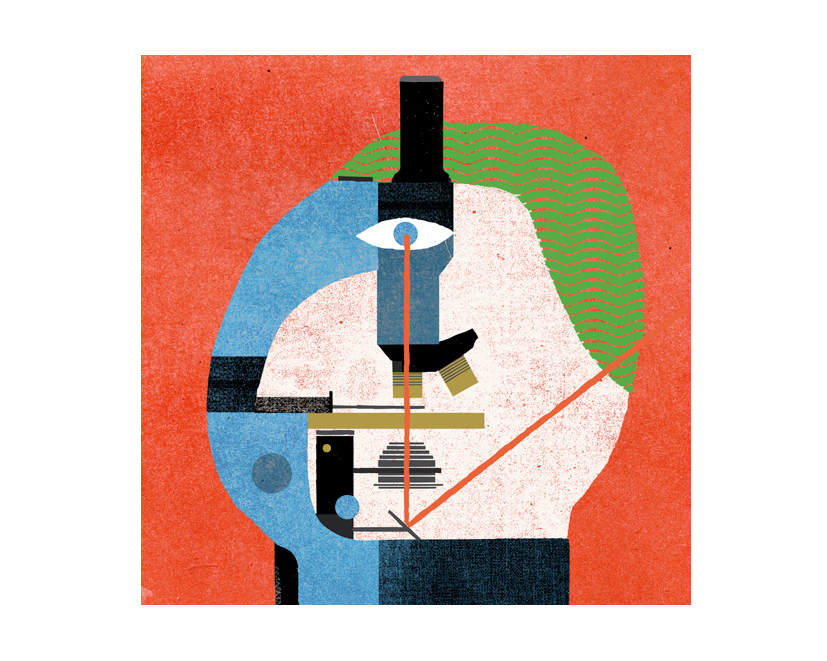
Illustration for Neue Zürcher Zeitung. Zürich - Switzerland
You have a wide range of work, in editorial, book cover, and poster illustration. Do you have a favourite type of project to work on?
I think my favourite kind of project is with editorial. Covers, for example, I really like, because I like to be more bold and to try to communicate something very specific but very simple. I always try to make something visually simple and not to put in too many elements – I like to be clear, not in the message but in the composition.
Illustration detail for ‘Her Majesty’, published by Taschen, Berlin 2012
Your illustrations all seem very flat and textured, often with a screen-printed quality about them. What is your process for creating your works? Do you work with paper or do you work mainly digitally?
It depends. I think 80 percent is digital, with Photoshop and a digital pencil, but I use textures that I create from my scans of real textures. Also, I don’t like to work with line, and particularly not lines made with the computer – for me it’s a bit artificial. That’s why I try to make surfaces. For example this white surface or this black surface, you can compose these without line. And when I try to do a line, I try to do it with a shape, and then to erase the shape. The way I work is very similar to collage, because I am working with shapes, with surface, and I am cutting the shapes out and creating compositions.
I really like the way you create interplay between colours, where they intersect and create positive or negative space. Your Labot Narrow poster, for example – the way you created the idea of light with simple lines is an elegant solution that is very clear, but also subtle.
For me it’s really interesting to try and create something just with light and shadows. Sometimes I try to restrict my use of colours, trying to think in the way that you would if you worked, for example, in woodcut or in etchings. You have to reduce the colour palette and try to think simply, in two colours, for example, and then finally adding the black. I like to play with these two colours in an order, in a hierarchy. First the background colour then the second one and then the black. The black is the last element, the bold element.
Labot Narrow’s poster for a gig in Berlin. 2012
Your studio here has a very tidy desk with your computer and a very untidy desk covered with paint, paper and stacks of other materials and old works. Do you enjoy working and creating compositions by hand?
For me, working by hand is a really nice experience. It’s totally different to the computer; by hand is always a pleasure. Last week I was doing some printing, and it was so nice to be there, physically printing with ink, feeling the materials. Also, as I started creating surfaces and collages in a digital way, I decided to try to do the same process but in analogue, starting with an idea and trying to make it with real paper. I was cutting some random forms and then trying to compose them in a nice composition. I think cutting things out is a way to become more abstract, not to represent something as you see it. I don’t want to use drawing as a way to represent something, because you are representing from some position of prejudice. Drawing almost becomes like the memory of the hand, but when you cut something it is almost a surprise, you can’t control it. I think this way for me is very easy because I am also… chaotic.
Do you have any artists or others who inspire you? I like the connection to Joan Miró in your use of colour and collage.
Yes absolutely, Joan Miró and Matisse, they worked a lot with collage and with surface and shapes. I love Picasso – for me he is very interesting, there’s always a lot of energy. Beautiful but with energy also. From a conceptual side I like Joseph Beuys, with his performance and sculpture, it is very powerful. Inspiration for me is a mix between German modernism, and some Latin American communist work from the 70s, and also typography in old books.
Illustration for Attitude magazine. UK
Do you have any exciting projects coming up?
I have a personal book project based on the history of my family – it is really an immigration history. My grandfather was born in Vienna, and moved to Uruguay, and my father was born in Uruguay and moved to Chile, where my mother is from, and now I am here! So I wrote a brief history of our family and now I would like to illustrate it, more like a graphic novel.
Looking to the future, how do you see your work developing?
It is difficult to say! I think in the last six years, my style has been developing. I think it has become more like classic illustration, more figurative and not so abstract. It’s difficult to keep this abstract thinking, when you are doing editorial work with a very complex subject that you have to represent, and I think that’s why it has become more figurative.
In the future I would like to mix a little bit more, to mix my illustration with some other directions. Something with a longer process, to be involved with conception through to the end. I like to create, perhaps writing, something for books and short films. I like storytelling. I want to mix image with sound, maybe with animation. Art. Everything!
Illustration for ‘Global Agenda’ of NY Times Magazine. Read the article. November 2010
Thanks Cristóbal! To see more of Cristóbal’s colourful work visit his website.
congratulations!!!!
I’m very glad you did it, and you’re having fun in Germany!
But… Drawing is many more things than ‘the memory of the hand’ Draw more!
Saludos desde Chile 🙂