Points for consideration for those new to the field.
By Jaleen Grove
—
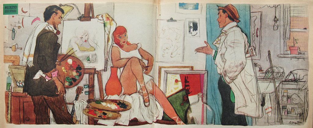
Image: Oscar Cahén, story illustration, Weekend Picture Magazine, April 25, 1953. Used by permission of The Cahén Archives
—
Author’s note: This essay was originally released by the author as a pdf in 2011.
It was published in Situation Gallery Magazine, Issue 1, Montreal, September 2013. I would like to thank Situation Gallery Magazine for editorial input.
——
In recent years art historians have begun to question the twentieth century taboos surrounding illustration. As the theorization of visual culture has progressed, the reticence to appreciate drawings and paintings made for magazines, advertisements, books and ephemera is increasingly acknowledged as symptomatic of a historical moment, now passing. That moment can be characterized as a time when “fine art,” intent on staking out new territory, was defined as superior to applied artistic practice on the grounds that “true art” was supposedly without use, more concerned with philosophy than pragmatics (the concept was developed by Kant from prior social class distinctions between artist and craftsman, and sociologists of art have since identified many avowed and disavowed uses of fine art in maintaining class identities). Because illustration was unrepentantly made for a utilitarian purpose (as most art was, over the centuries) it was downgraded as a foil—“not-art”—and as a result its enjoyable and historically relevant aesthetic characteristics have not been widely acknowledged for their artistic value.
The twentieth-century was likely unprecedented in its rapidity of social and technological changes, and illustration was accused by many of hastening some of the more negative outcomes of this process. But just as Baroque Dutch still life painting is today considered a document of the immense wealth and moral quandaries in the wake of early modern commerce, so too can the commercial art of the high modernist period be seen as a fascinating record of the changing lifestyles and values of the twentieth-century.
People who have developed their appreciation of fine art over a long period, perhaps beginning before visual culture became a trendy catchphrase, may have never looked at illustration art with professional understanding or detachment. First, illustration really is out to get you (that’s why it’s interesting) and so it’s natural that a thinking person should view it with suspicion. Second, the tools of connoisseurship in the mainstream art world have developed few instruments of interrogation appropriate to illustration, and so when asked to evaluate it, many experienced collectors make judgments that miss the boat.
There have, however, been a select few art collectors and scholars who never followed fashion, and who over the years have developed these tools. Some came from backgrounds in printmaking or book arts. Others were business executives who understood that illustration can promote a good idea as easily as a contemptible one. Many were just fans who got hooked because illustration complemented their subculture or life experience and was handed down in the same manner as so-called “folk art.” Meanwhile, illustrators themselves kept the memory of their favourite artists alive by preserving their colleagues’ estates, instituting History of Illustration lectures in their own art classes when Art History departments refused to offer them, and establishing their own archives and museums at places like the 100-year-old Society of Illustrators in New York. These insiders have created semi-private networks and built impressive collections that have recently begun to tour major museums. The 2001 Norman Rockwell retrospective at the Guggenheim necessarily had to draw from many private collections, since museums neglected popular illustration for so long.
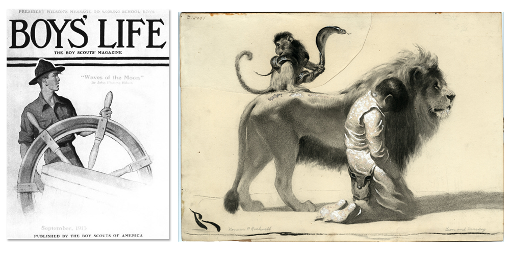
“Scout at Ships Wheel” - September 1913 cover of Boys’ Life, & “ The Ungrateful Man ‘The whole court was filled with confusion, though the animals, with no attempt” - (1917), by Norman Rockwell. From Wikimedia Commons.
—
So how do the people who saved a hundred years of print culture history from the garbage dump evaluate excellence?
They certainly use much of the same criteria that followers of gallery art do, because they too are educated broadly in art history. So were many illustrators. The familiar standards of technical proficiency, emotive feeling, historical relevance, influence and innovation hold, although the pantheon of leading figures, media, “isms” and groundbreaking moments are different. There is a whole other vocabulary as well.
Illustration merits a different manner of evaluation because of the following intrinsic characteristics:
Communication
First and foremost, illustration is about communicating a concept. Consider the ancient art of rhetoric—elements of language such as metonymy, synecdoche, understatement, amplification and so on all have corresponding visual strategies. Decide whether the tactic used is appropriate to the message and executed with visual eloquence.
Text-image relationship
Most, though not all, illustration was accompanied by a caption, a title, a gag, a set of instructions, a label, or a story. In what ways does the illustration make the text’s meaning clearer? More interesting, in what ways does the illustration change the text’s meaning? Has the illustrator actually enhanced and creatively commented upon the text, rather than simply mirrored it? What are the implications when the illustrator is also the author?
Wham! factor
Visual communication is intended to make you feel something, and feel it strongly, whether it be to make you laugh, shame you into action, horrify, titillate, or put you at ease. The power of the in-the-gut Wham! is what makes people bond with the image, and it is one measure of an illustration’s success. Don’t be ashamed to fall in love with something corny, gory, sexy, sentimental, funny—the seductiveness, delicious creepiness, guilty pleasure, or what have you is exactly what makes the work relevant and desirable; what makes you identify with it or recoil in horror. How successful—and how beneficial or dangerous—is that?
Aura
Walter Benjamin argued art’s “aura” (its worshipful aspect) was being killed by mass reproduction—but there’s a case to be made that reproduction increases aura by making something ultra-known and meaningful in multiple contexts (think of cheap woodcuts of Christian saints bought by pilgrims, the iconic portrait of Che Guevara, or the movement of the generic cowboy Western into local popular cultures worldwide). Aura is one part Wham! factor, one part cherished symbol, many parts travel. No work of fine art gains iconic status without reproduction either.
Intertextual cultural references
If you see a rabbit carrying a pocket-watch, would it not remind you of Alice in Wonderland? Popular culture frequently delights in making in-jokes (think of The Simpsons). This puts a whole new spin on the concept of originality. Sometimes, a copy is just a rip-off; other times, it’s a homage. You get to decide which. Often, illustrators spoofed famous works of art, news items, or other illustrations, or something quite arcane. When such winks can only be decoded by an initiated subculture, the work becomes a special document giving historical and cultural insight to that subculture. This plays an important role in how subcultures legitimize themselves to members, and become materially manifest within the parent society.
Creative Latitude
For decades fine art has decried that illustration was “prostitution,” in part because the illustrator supposedly always bent to the will of the client. Scores of artists who “had to” do illustration to feed their painting habit have promoted this negative idea—they, however, are the ones who never liked illustrating to begin with. The deserters’ perspective made modern art look cosmetically as if it never took patronage or fashion into consideration. The contrast was actually quite unfair to dedicated illustrators whose creative satisfaction comes from being deeply engaged with a team, a community, a patron (rather like contemporary artists working in “relational aesthetics”). Any illustrator can tell you that working with a demanding team requires more creativity, not less. A close examination of many top illustrators’ careers will show that they often took a creative lead in their collusion with authors and designers with stylistic envelope-pushing and communications problem-solving. Historically, denigration of illustration was initiated by jealous authors (such as Dickens) who resented being asked to write text to go with illustrations, and who disliked it when illustrators gave new meaning to their stories.
Additionally, where the fine art market demands consistency to build a brand-like signature style the artist is known for, in illustration this is optional, and can be a detriment over time. For every illustrator who became a specialist, there are several who worked multiple visual personae, even under pseudonyms, or who simply changed hats whenever the urge or necessity came (Bob Peak was one, popularizing very calligraphic line drawings and hot, flat colour fields in the 1960s, and slick photo-realism in the 1970s). Although illustrators have often campaigned to have their creative input more valued at the early design stage, by comparison the illustration world has afforded more creative latitude—and pressure to keep on innovating—due to it needing to constantly develop new markets and maintain current ones without getting stale.
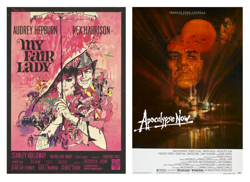
Bob Peake poster design - My Fair Lady (1964) and Apocalypse Now (1979)
Political incorrectness
Visual communication generally has to get its point across quickly, and so there evolved a kind of shorthand for depicting people that everyone knew stood for specific personality types. These “types” can be traced back in time in emblems, popular theatre, literary genres, and traditional puppetry. While not all types are objectionable, types frequently reflect political and social values of their origin, and thus can be very racist or sexist. After repeated use, we call them stereotypical (after the printer’s technique of making an exact copy printing plate from the original).
Some uses are conservative, others radical, such as comics and caricature, which operate like a medieval court jester’s act as a balance of power. Illustration scholarship uncovers the historical factors that resulted in certain visual traditions, and analyzes the effect they had. Sometimes what is now considered insulting actually began as a compliment; other times it was outright hatred. Collections of politically incorrect material help ensure that history is not forgotten or denied, or doomed to repeat; depending on the political climate, they can even protect freedom of speech. Some collectors reclaim questionable imagery in order to “own” and redefine it.
Continuity vs. originality
Where modern art movements such as abstract expressionism searched for new ways of making meaning because old forms were thought to be corrupt or dead, illustration kept continuity between past and future, finding old forms were not depleted after all. Old could be updated to usher in the new; sometimes illustration quoted and popularized avant-garde art, where otherwise that art would have merely alienated people. Meanwhile, illustration had its own innovators and avant-garde in each era. Having no care for conservation, Illustrators were free to use whatever materials gave the best results, leading to a large degree of innovation with unconventional media.
In modern art, originality is paramount. In illustration, innovation depends on the nature of the project and the intended audience. Sometimes the message is strengthened by adherence to tradition: think of Christmas themes, for example. On the other hand, a radical take on Christmas might be perfect for a particular audience. The key difference is that illustration does not simply value an avant-garde approach because it is experimental. Illustration also asks, “Is it effective?”
An equally important criterion is whether or not the work is an outstanding exemplar of its particular genre: does the pin-up have the requisite long legs? Is the botanical illustration formally beautiful even as it meticulously and accurately describes the species? Each sub-section of illustration has its own set of rules—it’s up to you to decide how well the artwork exemplifies them or gainfully bends them. Both approaches are valid.
Print media
An understanding of the technical limitations, technical advantages, and distribution channels of different types of printing technology is essential to appreciating why a given illustration looks as it does. For instance, pulp magazine art was made in extremely saturated colors because the poor paper dulled ink down so much in the final printing—and pulps relied on lurid color to attract the eye on the news-stand, because they often didn’t often sell by subscription. Pulp collectors look for this snappy color because it is integral to the form. In “slicks”—glossy magazines—often black and white artwork would have been embellished with spot colors, which were not painted on the artwork but instead specified with an overlay and applied by the printer. This, along with the fact that the master printer makes aesthetic decisions about the colour balance and quality of the ink and paper, which the illustrator (or art director) often approved after inspecting a proof, warrants considering the printing press as an artistic medium in itself, not just a mute reproductive technology. The illustration connoisseur should understand the difference between offset litho, rotogravure, chromolitho, photogravure, wood engraving and so on—and remember that many illustrators consider the print to be the final artwork—not their drawing.
Illustration by Judith Carnaby
Condition
Illustration art was sent to the art editor, designer, or graphic artist, who then glued down registration marks and marked it up with instructions to the printer in lead or “non-repro-blue” pencil. These are normal and so do not merit as serious a downgrade as might be the case if scribbling and glue appeared on gallery art. A conservator can remove them if they interfere with the art; some prefer to leave them because they are integral to the medium.
The illustrator him or herself may have used white-out or blue pencil along with black ink to create line art. This should not be considered poor condition, or bad craftsmanship, because it is inherently how the artist is supposed to work under the eye of the camera, which does not register the blue or white (see comment re: final art above).
Illustration was frequently not made or handled with any consideration for posterity, and so a little tolerance of occasional deterioration is in order. First the unconventional materials that afforded creativity may also have been unstable. Second, original art was often thrown away once it was published and many pieces on the market today were literally pulled out of the bin, worse for wear. Some collectors tolerate marks and missing parts as battle scars of survival of a once-denigrated medium, the history of the material object being as interesting as that of the image itself. Overlays may be missing, colours faded, collaged items flaked off. Compositions may look strange and unbalanced, because they were designed to be seen with type. Again, you must consult the printed pages (called tearsheets) to get an idea what the original art looked like and decide whether its deterioration affects its value.
Display
While illustration art can look great on the wall, this was never its intended purpose. Some illustrators and comics artists express doubts about whether their work ought to be in museums, installed without its accompanying text. The practice of enjoying the illustration in its intended medium (a book, or album cover for instance) and at its intended scale (much illustration is painted larger than its printed size) is integral to the art form. Also, the artwork can look quite different if the printed final included spot colours and other printing effects. Don’t be surprised if an illustrator doesn’t seem to care about museum or gallery shows! Their work gets far more exposure in print. See if you can respect the intent of the original even when displaying the work as art – having the printed rendition on hand, for instance.
Periods and styles
Illustration is often said to have begun with hunters depicting their game on cave walls. Some prefer to define illustration as only images accompanying text, usually books. Still others limit it to images reproduced mechanically, while another contingent feels illustration is any explicitly narrative figurative work in two dimensions. Each of these attempts (and there are more) to define illustration are flawed, but all agree that illustration entered a new phase in the 19th century with the development of cheaper paper, automated printing presses, greater distribution networks, and rising literacy.
Out of this came the notions of “mass” media and “mass” thinking, where unprecedented numbers of people were exposed to the same ideas. While true in principle, the notion of “mass” breaks down upon closer examination. Certain illustration styles were frequently paired with certain subjects, which in turn appealed to a specific subculture, strengthening that group’s individuation. Regional variations occurred. Genres splintered into subgenres, each brewing its own variation of visual culture and audience. The connoisseur of illustration does not see an undifferentiated mishmash of commercial art—he or she sees subtle semiotic nuances pointing to kinds of people, values, lifestyles, places, and time periods.
Key periods:
1830-1860 Stone lithography allowed illustrated periodicals to flourish, bringing infamy to caricaturists and cartoonists especially.
1850-1870 Wood engraving enabled cheaper illustrated book and magazine production, while chromolithography boosted fine art reproduction and pictorial advertising. In the USA, Civil War reportage accelerated the consumption and production of illustrated news.
1880s Invention of the halftone allowed photographs and artwork to be reproduced without being filtered through the hand of the engraver, bringing illustrators recognition on par with that of fine artists.
1890-1920(ish) The “Golden Age” of illustration, when print was the primary medium of communication and illustration was used as much as or more than photography; Illustrators were at their highest point of being in demand and were celebrated and paid as artists of high repute. Visual advertising became a serious social force.
1920-1950 Illustrators gradually lost ground to photography; the high/low divide between fine art and illustration downgraded the status of the latter. Pulp fiction and pin-ups peaked 1930-1950.
1950-1970 Magazines began to fold after 1950 due to TV; younger illustrators began to rebel and illustration became more experimental and conceptual. The new field of graphic design took over much of the autonomy and creative input illustrators formerly had. Studios began to close and proportionately more illustrators became freelancers. Illustrators began compiling a history of the field.
1970-1995 Editorial illustration enjoyed much freedom of speech and prestige; after 1990, cheap “stock” art available digitally began to ruin illustrators’ livelihoods.
1995-2010 Illustrators began to self-advocate collectively, and the ICON conferences began; underground comix rejuvenated the industry and made illustration hip again in fine art and design. Many illustrators found new roles in animation and new media, and new respect as creative leaders. Scholarly interest in illustration began.
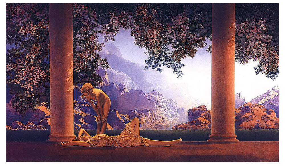
“Daybreak by Parrish (1922)” by Maxfield Parrish. From Wikimedia Commons.
Whereas many fine artists voluntarily banded together to form groups or collectives devoted to a specific artistic goal, illustration “schools” evolved organically out of the more famous studios where especially successful illustrators worked. A studio was a business where many illustrators were employed (somewhat exclusively) on salary and/or commission. The studio also employed salesmen, photographers, retouchers, and others to help get and produce camera-ready art for advertising agencies and other clients.
Brandywine – not a studio, but a colony following the teacher Howard Pyle, who is best-remembered for his pirate characters, which set the type that informed the film Pirates of the Caribbean. Brandywine is a region near the Delaware art school (sometimes misidentified as “Chadds Ford”) where Pyle taught circa 1900. He encouraged artistic autonomy and painterliness in students’ work (primarily illustrating fiction). His most famous students include NC Wyeth (established the standard for heroic adventure and action stories), Maxfield Parrish (his classicized, romantic metaphor of puberty, Daybreak, was one of the most reproduced images ever [see above]), and Jessie Willcox Smith (illustrator of mothers and children).
Sundblom Studio – Haddon “Sunny” Sundblom was a Chicago illustrator who established a large studio from the 1920s to the 1950s that handled much advertising. He demanded his staff learn to paint like he did because he had contracts that depended on consistency for branding (most famous was the Coca Cola Santa Claus). This style is sometimes called “buttery” and is what most people think of when they imagine classic American advertising illustration: very upbeat and idealized with strong realistic modeling and life-like depiction of light and texture. His more famous followers include Andrew Loomis, who wrote the most complete textbook for illustrators; and Gil Elvgren, the pin-up illustrator.
Cooper Studios – this studio employed the most famous boy-girl illustrators of the 1950s, such as Coby Whitmore and Jon Whitcomb (think sexy housewife romance stuff in gouache). By the late 50s,however, they had hired Murray Tinkelman, whose early whimsical black-and-white pen drawings hearkened back to early modern woodcut and eventually evolved into tightly cross-hatched, surreal commentary, a move that signaled the shift to conceptual illustration.
Pushpin Studio – at the front of the turn to conceptual illustration was Pushpin Studio, founded in 1954, where Milton Glaser and Seymour Chwast practiced a tight integration of text and image, bridging illustration and graphic design, and ushering in a postmodern approach where antique sources mingled with the new. They did not shy away from popular culture at its most base, and they embraced the immediacy of “bad” drawing. Glaser’s most iconic work includes his 1966 psychedelic album design for Bob Dylan; Chwast is known for subversive irony, such as his 1967 anti-war poster, End Bad Breath.
Bob Dylan by Milton Glaser
Talking with illustration collectors
Unfortunately, much of twentieth-century art theory has resulted in enormous, antagonistic walls between the world of modern/contemporary art and that of applied art. As a result, when representative collectors meet, they may be mutually shocked at how ignorant or prejudiced the other party seems. Suspension of one’s preconceptions and a willingness to listen are imperative to making these halves whole again. Doing so allows us to see how the two have influenced one another and how they are not so different after all.
Museums and Galleries Specializing (or with large collections) in Illustration:
NY Society of Illustrators Museum of American Illustration (NY)
Norman Rockwell Museum (MA)
New Britain Museum (CT)
Delaware Art Museum (DE)
Brandywine River Museum (PA)
National Museum of American Illustration (RI)
Illustration House (NY)
Crystal Bridges Museum (AR)
House of Illustration (UK)
Chris Beetles Gallery (UK)
Galerie 9e Art (France)
Ehon Museum Kiyosato (Japan)
Coming soon: Lucas Museum of Narrative Arts (IL)
In Canada, the only comprehensive collection of illustration art was recently deaccessioned by the Glenbow Museum and it rests in storage pending finding a permanent home. Individual illustrators’ fonds may be found in a smattering of institutions. Significant cartoon collections are held in the National Library and Archives, McCord Museum, and Simon Fraser University.
—
Addendum: Events as of August 2014
In 2013, a consortium of illustrators, historians, collectors and other knowledgeable people known collectively as The History of Illustration Project came together to produce a History of Illustration textbook. A contract was signed in July, 2014 with Fairchild Books, a subsidiary of Bloomsbury Publishing.
historyofillustration.org
—
Jaleen Grove is an art historian with a specialization in illustration studies and illustration history. She is currently writing a book on Canadian artist Oscar Cahén (Art Canada Institute, 2015), and co-editing and writing A History of Illustration (Bloomsbury, 2016), the first textbook in this field. Grove has taught History of Illustration at Parsons The New School of Design and Art History at Stony Brook University, and she serves as Associate Editor of the Journal of Illustration.
A rich visual history of 20th century illustration in an outline analysis by Jaleen Grove.