WALTER TRIER (1890 - 1951) March 2014
—-
WALTER TRIER / LILLIPUT – The Pocket Magazine for Everyone
Article, portrait and exhibition photography by Judith Carnaby
This month’s writing for Illustrators Illustrated is an investigation into an illustrator working in the early- to mid-20th Century and an overview of a current exhibition of his work.
—-

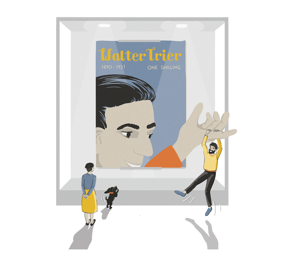
WALTER TRIER / LILLIPUT – The Pocket Magazine for Everyone exhibition at O32c/Joerg Koch, March 2014
When we think of the 1930s and ’40s it is not often with colour and cheer, but Walter Trier’s front covers for Lilliput magazine are bright and exuberant even though they have had 70 years to age.
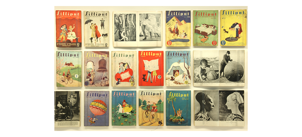
WALTER TRIER/LILLIPUT – The Pocket Magazine for Everyone is an exhibition of nearly all of the 147 covers illustrated by Trier for Lilliput between 1937 and 1949. Currently on show at O32c/Joerg Koch in Berlin’s Mitte district, the magazines are the personal collection of Udo Kittelmann, director of Berlin’s Nationalgalerie.
Trier was one of the Weimar Republic’s most famous illustrators and his illustrations for the magazine are playful, memorable and slightly surreal. Every cover features the same couple: Frau Lena and Herr Walter, and their Scottish terrier dog, but for each new issue the three characters are reimagined. They are drawn in different places and ages, as different ethnicities and as various objects: as statues or topiary hedges, on a gondola in Venice, as wind-up toys, gardening, swimming, looking at a bomb, or as Victorian late-night shoppers. In one image they stand on a distant cliff-top; in another they are woodland sprites sitting in a tulip.
Exhibition detail, March 2014
Lilliput was a pocket-sized British antifascist monthly magazine containing photography, literature and art that was widely popular throughout the Second World War. Simply presented in a single long vitrine the exhibition showcases Trier’s hugely imaginative covers interspersed with pages opened to reveal funny photographic ‘doubles’ devised and selected by the magazine’s founder Stefan Lorant. Before seeing the exhibition I knew nothing about Walter Trier or the magazine, but having read ‘antifascist illustrator’ in the press release, I was intrigued to see how he approached his illustration work with Lilliput.
—-
Walter Trier was born to German-Jewish parents in Prague in 1890, and moved to Berlin in 1910 following his studies in art. Developing his practice at a time of huge political upheaval in Berlin in the post-WWI period, Trier can be placed alongside his contemporaries and other antifascist and satirical artists like George Grosz and pacifist artists such as Käthe Kollwitz. Trier developed his style creating cover illustrations for journals UHU and Die Dame; political illustrations for Simplicissmus, a prominent satirical German weekly magazine (also contributed to by Grosz and Kollwitz); and Jugend, a magazine about contemporary art and culture that gave the world the name ‘Jugendstil’- the German version of Art Nouveau. During the early 1920s Trier also created stage designs and murals. The most famous mural he painted was created in 1929 on Kurfürstendamm in Charlottenburg, and like so many other artists of the time his work was affected by censorship: the mural was destroyed by the Nazis in 1933.
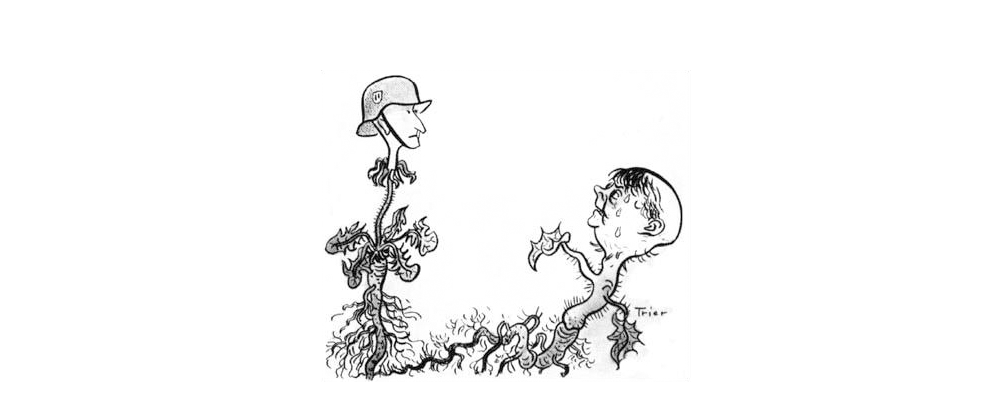
‘Two Weeds: the Creeping Quisling and the Common Heydrich’ (Image from spartacus.schoolnet.co.uk)
Trier’s most widely recognised and commercially successful work came in the late 1920s with his illustrations for Erich Kästner’s popular children’s stories. The most famous is Emil and the Detectives (in German Emil und die Detektive), first published in 1929 and later adapted into films and animations. Trier’s illustrations were full of character and often only used simple linework and shading, a style perhaps inspired by German humourist and illustrator Wilhelm Busch. Published in 1865, Busch’s much loved work is Max and Moritz (in German Eine Bubengeschichte in sieben Streichen, Max and Moritz), a series of seven illustrated stories written in verse following the antics of two mischievous boys. Emil and the Detectives and Max and Moritz remain two of the most widely recognised and popular illustrated stories in Germany.
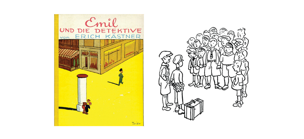
Emil und die Detektive (1929) front cover and detail (Images from Wikipedia)
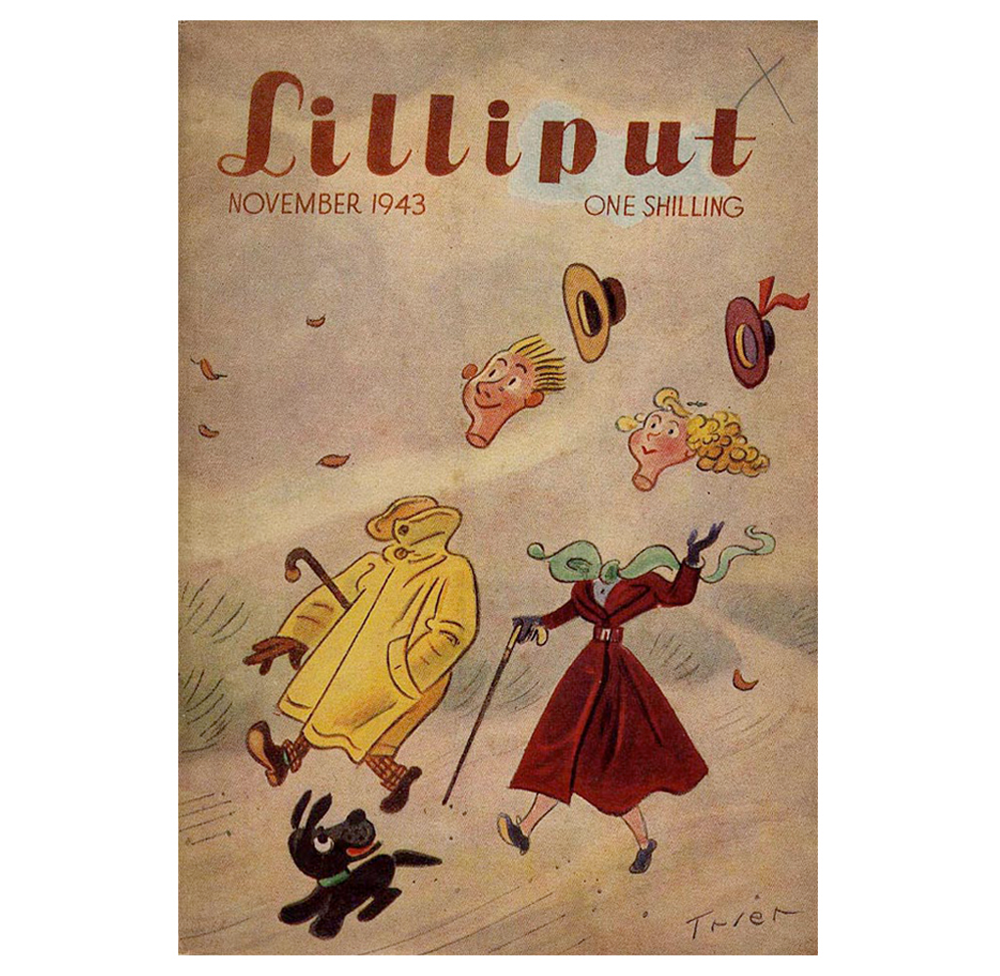
Emigrating to London in 1936 due to the extreme oppression in Nazi Germany, Trier began work with Lilliput from its founding in 1937 and continued illustrating the covers for the following 12 years. The publication was started by Stefan Lorant, a well known and successful filmmaker, photojournalist and Hungarian exile, and remained in production until merging with a men’s magazine in 1960. It is impressive for an individual illustrator to create and nurture such a long and deep collaboration with a contemporary political and cultural magazine, and the same sense of fun and playful imagination from his earlier work can be seen in Trier’s covers for Lilliput. In particular is a fantastic illustration of the couple as they are blown apart by the wind on the cover of November 1943 edition (below). A quote from Trier in Graphis (Edition 22 1949) reads,’ I did a great deal of sketching before the final acceptance of of my proposal, which was to have a couple with a dog on all covers: the couple as the embodiment of something eternally amusing – youth, love – and the little Scottish terrier out of regard for the English love of animals and as a memento of Zottel and Maggy, my companions for many years.’ By limiting the structure of his illustrations to the three characters, it gave him the freedom to be experimental in a way that also maintained a cohesive visual identity for Lilliput.
(Image from fulltable.com)
The covers are neatly lined up in chronological order and the gridded structure of the presentation makes you appreciate the impressive variety of the illustrations. Trier explains the breadth of his work; ‘I refused from the outset to keep to a definite type of couple. Sometimes they are young, sometimes older, sometimes naturalistic and sometimes stylised, in all possible costumes of all sorts of periods, not even always of flesh and blood, but as clipped trees or fruit, or often as toys.’ (Graphis, Edition 22 1949). As you move down the row from cover to cover the illustrations start to become less of a collection of magazines and become more a collection of ideas. As the covers are small you are drawn right up to the glass, peering into the vitrine at each new image with the same sense of delight as readers at the time must have felt before each new issue.
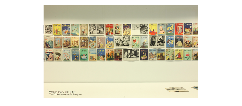
Exhibition detail, March 2014
Interwoven with the front covers are a selection of pages of photographic juxtapositions – coined ‘doubles’ by Lorant. The doubles place two photographs of often completely arbitrary subject matter, but similar form, alongside each other in the then contemporary fashion of Dada/Surrealism. The visual outcome was contradictory, shocking, and often hilarious. My particular favourites were the mirrored forms of a judge’s wig, and a toilet brush, titled ‘Law’ and ‘Order’ respectively. In I Heart Design (2011), edited by design historian Steven Heller, designer Ken Garland says, ‘As a child of eight, I was a devoted patron of Lilliput from its launching. The monthly ritual of unveiling the array of doubles is a keenly remembered delight to this very day; and I was surely not the only future graphic designer or photographer to be so entranced by them.’
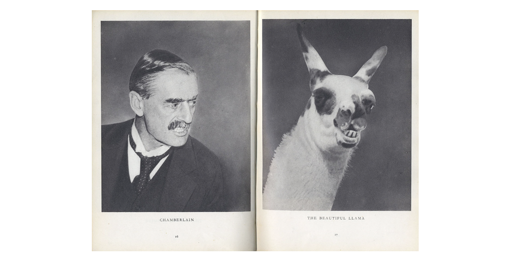
‘Chamberlain’ and ‘The Beautiful Llama’ (Image from fulltable.com)
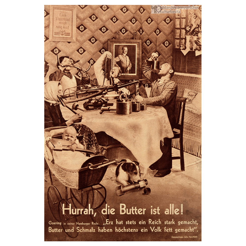
However the doubles were not without a political basis. The relative space for dissent in England in the late 1930s and 1940s allowed Lilliput‘s editors more freedom to include political and antifascist literature and content, as well as benefiting from a strong tradition of satirical magazines and writing, such as Punch magazine. One of the more radical doubles presented in the exhibition are two antifascist photomontages by John Heartfield, also a German exile to London. Photomontage was a new technique developed by Heartfield (formerly Helmut Herzfeld) with George Grosz in Berlin in 1920. One of the photomontages presented is perhaps Heartfield’s most famous image, parodying the aesthetics of propaganda and satirizing a quote by Hermann Goering, Hurrah, die Butter ist Alle!
(Image from Deutsche Geschichte in Dokumenten und Bildern)
The popularity of Lilliput and Trier’s covers are a great example of how illustration is a critical tool for creating a wide audience for political issues. The light-hearted nature of the covers contrasts the more political content inside the magazine, although humour was used throughout. Tom Hopkinson, who took over as editor in 1940, says in his book Of This Our Time (1982), ‘In wartime particularly, Lilliput was an easy magazine to sell. It made no demands. It did not attack or criticize. It simply made one laugh, providing a couple of hours of easy enjoyment.’ The power of illustration is the ability to reach a broad cross-section of society and to draw in people who might otherwise not be so politically engaged. In wrapping Lilliput in a cheery cover, it allowed the magazine to reach a wider audience than if it had used more overt imagery. Trier says, ‘ I have never given the covers a topical political note. Even in the frantic years of the war they stuck to the simple praise of the twosome. We read in numerous letters from soldiers how grateful they were to us from keeping our covers so far removed from the war.’ (Graphis, Edition 22 1949). There are not many opportunities to see such an impressive collection of historical illustration and this exhibition gives a fresh perspective to an era that we often see differently. Without the opportunity to view the rest of the content of the magazines you are focused only on the vibrant series of illustrations. They could charm anyone into buying a copy of the magazine, reinforcing the idea that Lilliput was the antifascist magazine for everyone.
—-
WALTER TRIER / LILLIPUT – The Pocket Magazine for Everyone is on view until March 27, 2014.
032c Workhop / Joerg Koch
Brunnenstraße 9 10119 Berlin
Wed- Fri 12-18.00
—-
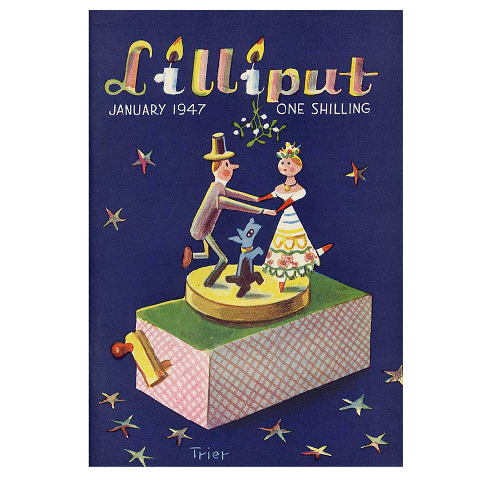
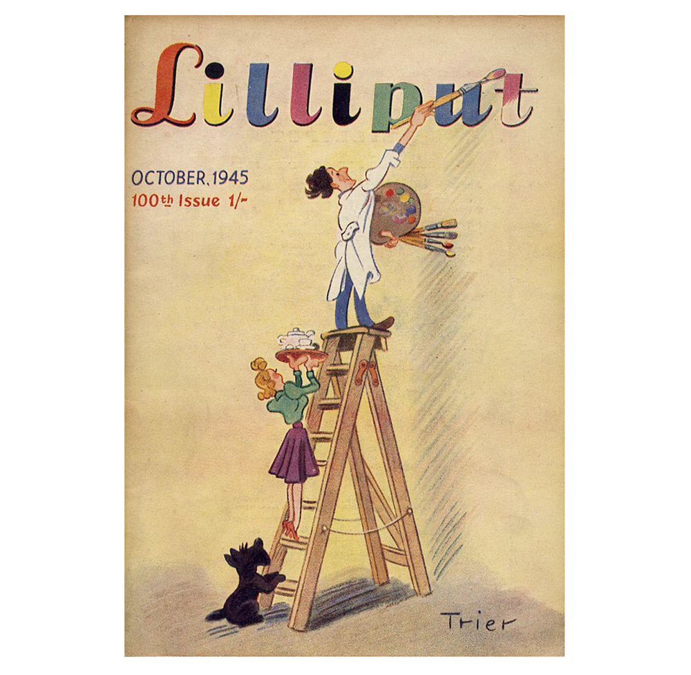
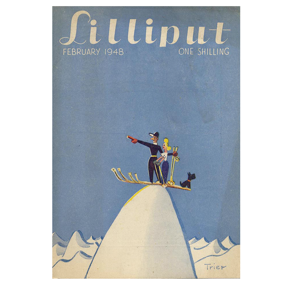
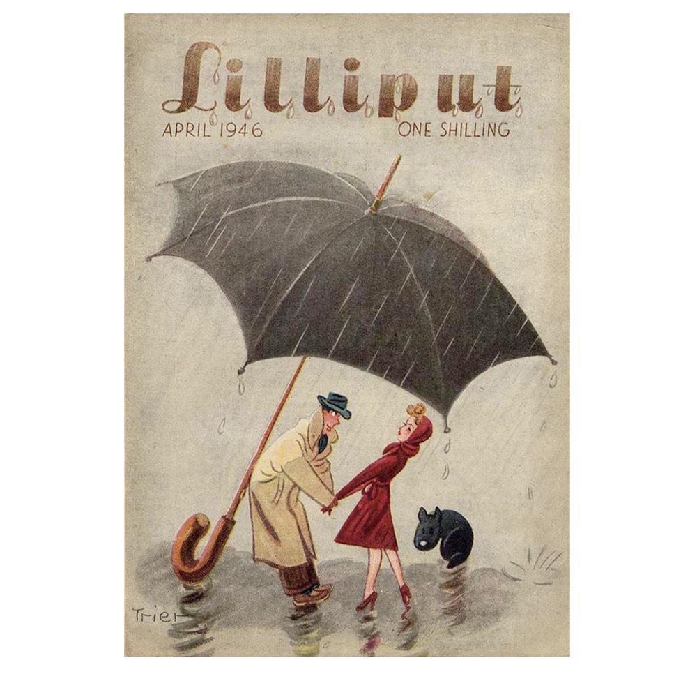
(Previous 4 images from fulltable.com)
I grew up reading Kastner’s beautiful books…. simple Trier’s illustrations were equally magical! Thank you Walter for your splendid work!