Interview and portrait by Judith Carnaby
August 2013
On a warm summer night in early August I met illustrator and designer Dylan Taylor in his home in Neukölln for a chat about his work.
Originally from Christchurch, New Zealand, Dylan has spent the last four years in Europe – first in London and now in Berlin. He currently works full time as a digital interface designer with a small Berlin start-up, merging his knowledge and enjoyment of design with his freelance illustration work.
Dylan’s works are a playful mix of awkward hand-drawn shapes and tidy geometric structure with a wide variety of subject matter. Looking around his space you can see visual influences that range from record covers, comics, packaging, vintage board games to graphic travel posters from the 1940s. Sitting on his desk are pieces of his illustration work from a recent exhibition – beautifully finished, bright, colourful, textured and flat.
Here we talk about the basis of his illustration practice, his interests and design aesthetic, and share musings on contemporary illustration and design.
——
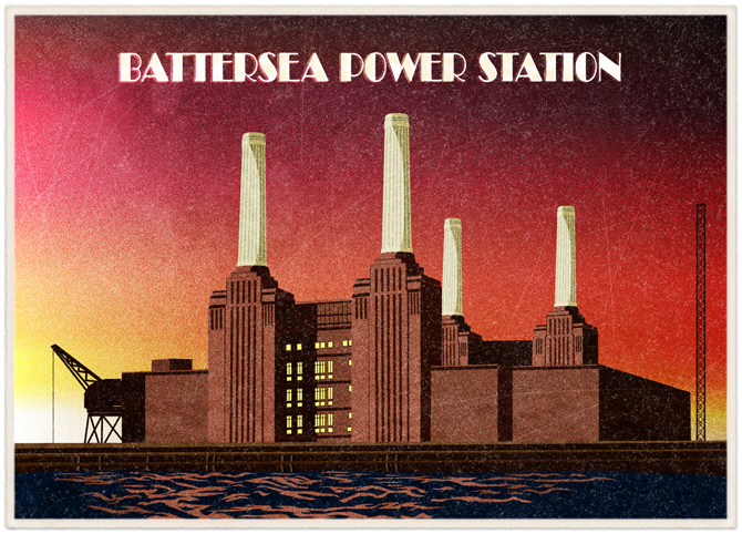
Battersea Powerstation postcard – The Daily Telegraph
You create very bold, grubbily textured works, a mix between organic and perfectly formed, simple block shapes. Do you have any principles of design that you always try and work with?
I have a number of variables that I try and limit myself to, and that’s part of a conscious effort to create an identifiable style. I quite naturally have a tendency to draw figurative works in a semi-awkward manner. When I was studying, my illustration teachers actually said, your figures have a really unhuman quality to them, they’re very wooden, kind of like mannequins, and at the time that really upset me because I really wanted something else. But then at some stage I picked that up and ran with it because I realised that there was something kind of charming and interesting about this.
Do you ever draw from paper first?
I almost always do paper sketches first actually, but the tools that you use have an affect on the way you draw. I am always aware when I am drawing on paper of the next step in the process- – that there’s no point in drawing something ridiculously organic, it will feel like pulling teeth when I’m trying to convert it to vectors. I guess that’s one thing about my illustrations, this battle between trying to make things very graphic and geometrically pure, when sometimes my lines can be skew-whiff and not as symmetrical as a perfect logo would be.
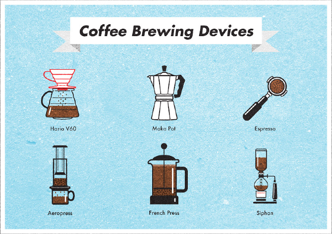
Self initiated image of coffee brewing devices
Do you find then, that your use of texture is a way to work against the really bold graphical elements?
Sure. I use a lot of textures in my work, either scanned from the real world or digital photos that are then laid over some kind of texture. It’s a way to keep it from being to flat and too computery. I don’t want to use the word ‘digital collage’ but yeah… I think I’ve taken that as my area, somewhere I like to work in.
Is there an aspect of your work in which you find the most satisfaction, something that gives you pleasure?
To sum it up, it is when I’m able to communicate something in a very simple way. When I was studying I had a lot of influence from other kinds of illustration – comics and graphic novel style work that was immaculately rendered. Not simple flat colour work, I’m talking about something that was between fine art and the comic world. That was what I was interested in at the time. And then coming out the other end of design school I had been taught about the concept of communication and had it drilled home to try and make things clear, concise and easily communicable. So in that sense my graphics education really made a strong imprint later on in my illustration because I saw the beauty in simple graphics.
These ideas of simplicity and clear communication, are they also part of the practices of illustrators and designers that you respect? Do you enjoy those aspects in other peoples’ work?
I appreciate quite a range of things, it depends on the purpose. When I was a bit younger I definitely had more of an appreciation for people who were able to create highly complex and detailed works. I still do. I really appreciate people who are amazing at doing character concepts and this kind of development – like video storyboarding. They are worlds apart from the sort of work that I do, but I still have an extreme respect for it because it takes a different kind of imagination. But in saying that what I think I admire the most in other people’s work is when they’re able to do a lot with a little.
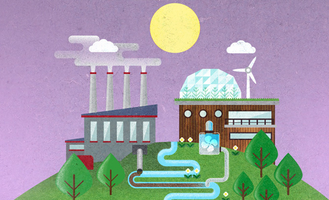
Detail from One Big Voice website
In a lot of contemporary design and illustration practices there seems to be a swing back towards modernism and reductionist aesthetic. Your illustrations are very flat, and the design world seems to be going towards flatness. Is that something you seek in your work?
Yes it is. It is something I have been very conscious of for a long time. Something that I really disliked about digital illustration for ages is that there didn’t seem to be much of a place for really simple illustration. It was was like people got really excited about having hundreds of Photoshop layers and effects and somehow in all of that hype the appreciation for simplicity was lost.
I guess the majority of people working in illustration toady are going to be working towards a digital end product and therefore create all their work digitally. How do you find this intended outcome influences you?
I’m not trying to hide the fact that my work made on a computer at all. I see some illustrators out there who almost try to cover their footprints – they’re making things on the computer in a way that try to look like they’re done in a print studio. I find a certain amount of this really interesting as well, when people reintroduce inconsistencies that appear in print in a digital world. For example when you’re doing a two colour screen print and your screen shifts by half a centimetre and you get a funny sort of overprint, a lot of people are using techniques like this to somehow revive the feeling of print within digital work. It’s a really interesting tendency in the digital age to do this – it’s the equivalent to an Instagram filter in a way.
I think much of an illustrator’s job is to be aware of and to be part of the social and cultural world in which we live and to be reflective and critical about that. You work more within the developing technology world, but do you also get influences outside of working within that industry?
I hold a lot of respect for illustrators working in the editorial field where they really have to have a firm grasp of current events. A lot of political illustration is very reliant on that. I can’t say for myself that I’m so much involved in that method of delivery. For me it’s more from a technical back ground actually. Another example is that in recent years in terms of technical illustration, informational graphics have become extremely popular, something that a lot of people have scrambled to get on board with. I think people have their different strengths, some are incredibly able to describe a social situation or a current event in a very witty and concise manner, with some kind of stroke of genius, and then others are able to condense very complex data into very simple symbols. I guess for me it’s something in the latter.
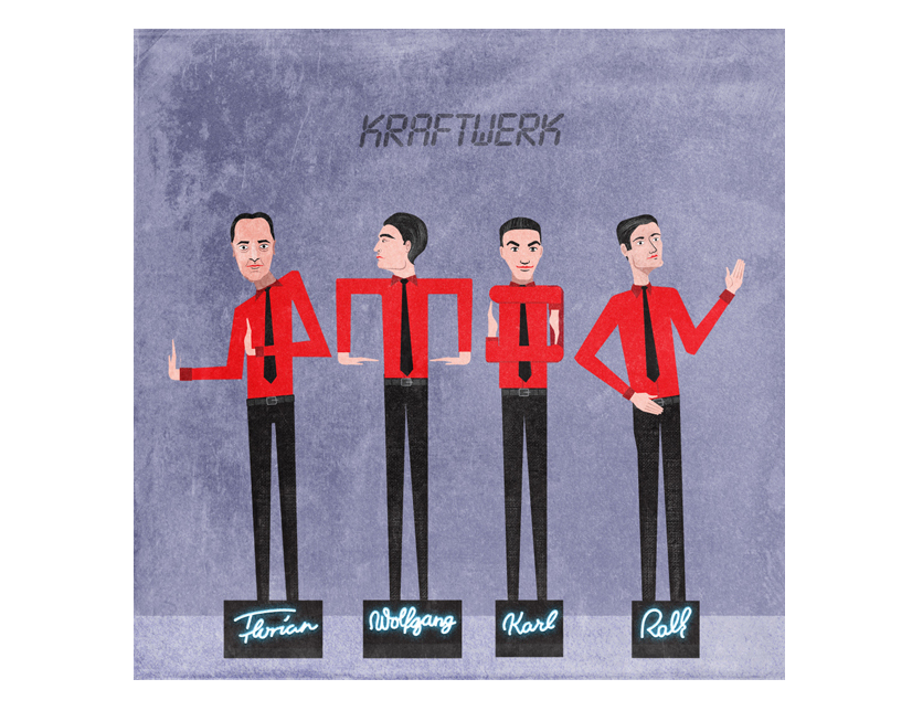
Kraftwerk, from A-Z of Musical Heroes
When it comes to the subject matter for your personal illustrations, aside from the work that you are commissioned to make, do you have any areas that you are particularly interested in?
One thing I’ve noticed about myself is I have this tendency to do series of things. I don’t seem to be happy to create just a one-off illustration about something, I always want to follow it up with another somehow related to the same field. For example, I have this project trying to make an alphabet of my musical heroes – people from my record collection – and of course that has to be an A-Z. But then I also became slightly obsessed with drawing food and the idea of national dishes because I really enjoy eating and cooking, and I didn’t want to stop at just one of those so it has also become a series. But it’s kind of nice to have things that feel like they’re still open to be revisited, that they’re always there to return to.
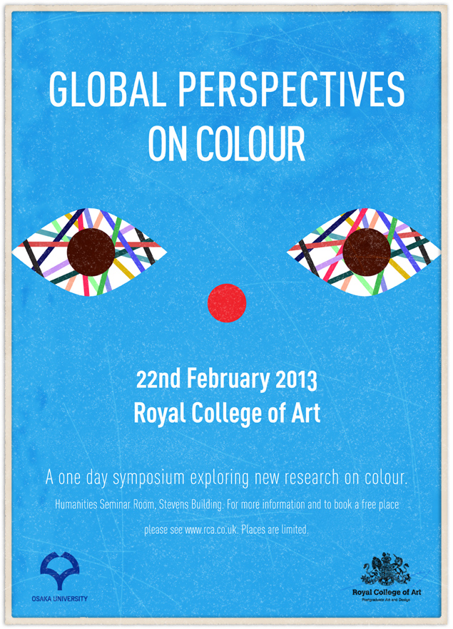
Poster illustration and design for the Royal College of Art, London
At the moment you’re working mainly in digital interface design and working freelance as an illustrator. How do your feel these two roles complement or counteract each other?
For me they’re fulfilling pretty similar roles. I’ve always been caught between this world of design and illustration, and design has always been full time work which leaves very little time to follow the freelance path. Moving to Berlin has meant the last year or two has been an opportunity for me to go freelance, and to get my name out there and to work on projects that I was passionate about.
Is the melding of your design and illustration work also going to be something that you will work towards in the future?
Yes absolutely. In the future I would like to have my foot more strongly in the illustrative design world. I’m doing a lot of digital design – a lot of interface design at the moment which has had quite a huge renaissance of icon design and development in recent years with mobile technology and improving web technologies, so we’ve seen a platform for this kind of illustration to be popular again. I’m quite consciously trying to work my illustrative styles into a direction that marries these two things together quite well, and I think that’s the same for a lot of young designers and illustrators. Everyone’s looking for a platform or an end output for their work, and at the moment this is quite a good one for me. Ideally I would really like to find myself in a position where I’m not necessarily an external resource, where I’m something more like an art director who is both creating work and having a vision for a project as well. I think for me an example would be to come up with a concept for a website or a mobile application and be able to direct all of the interactive components, all of the concept behind the site, as well be able to create the iconography and interesting imagery.
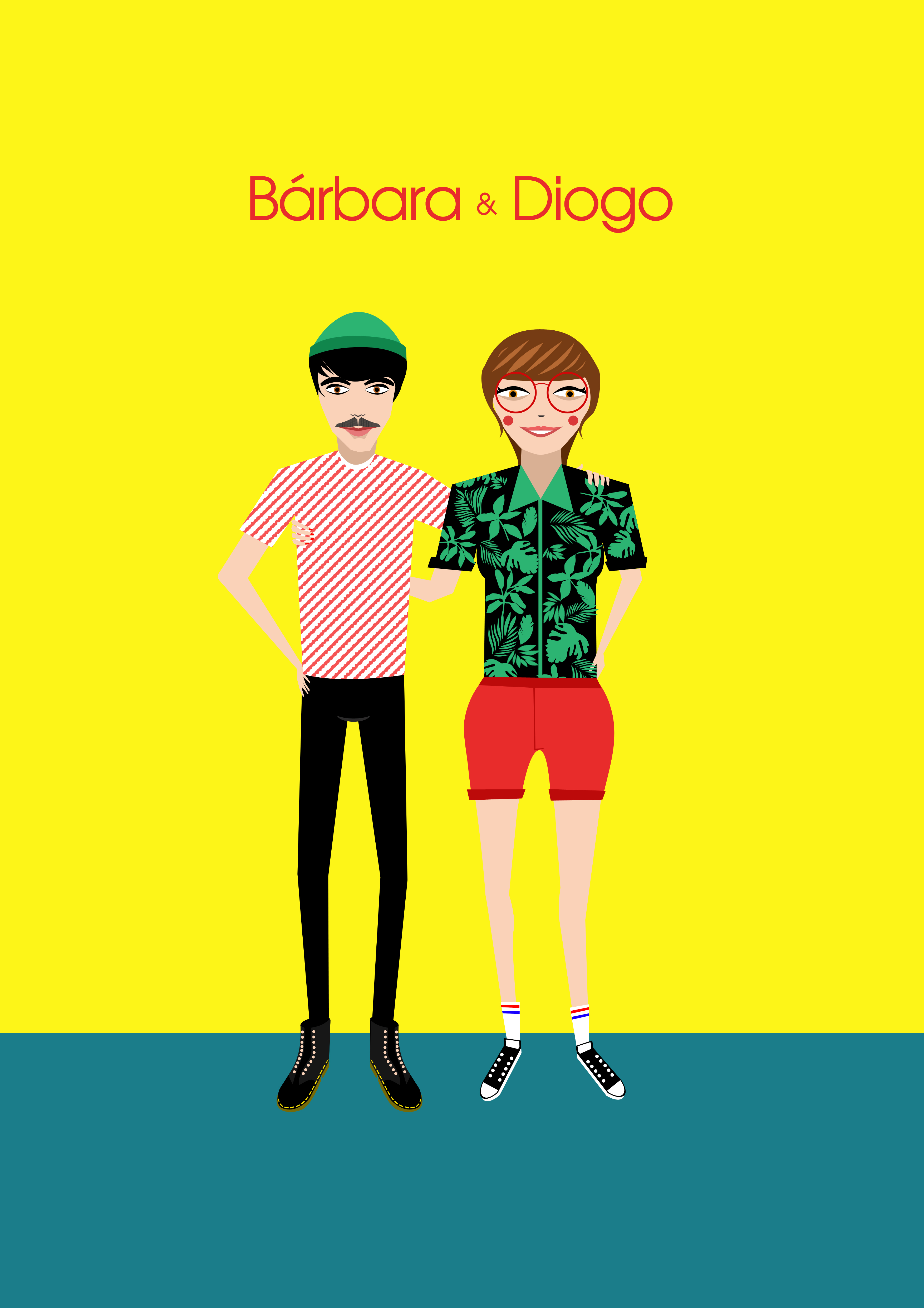
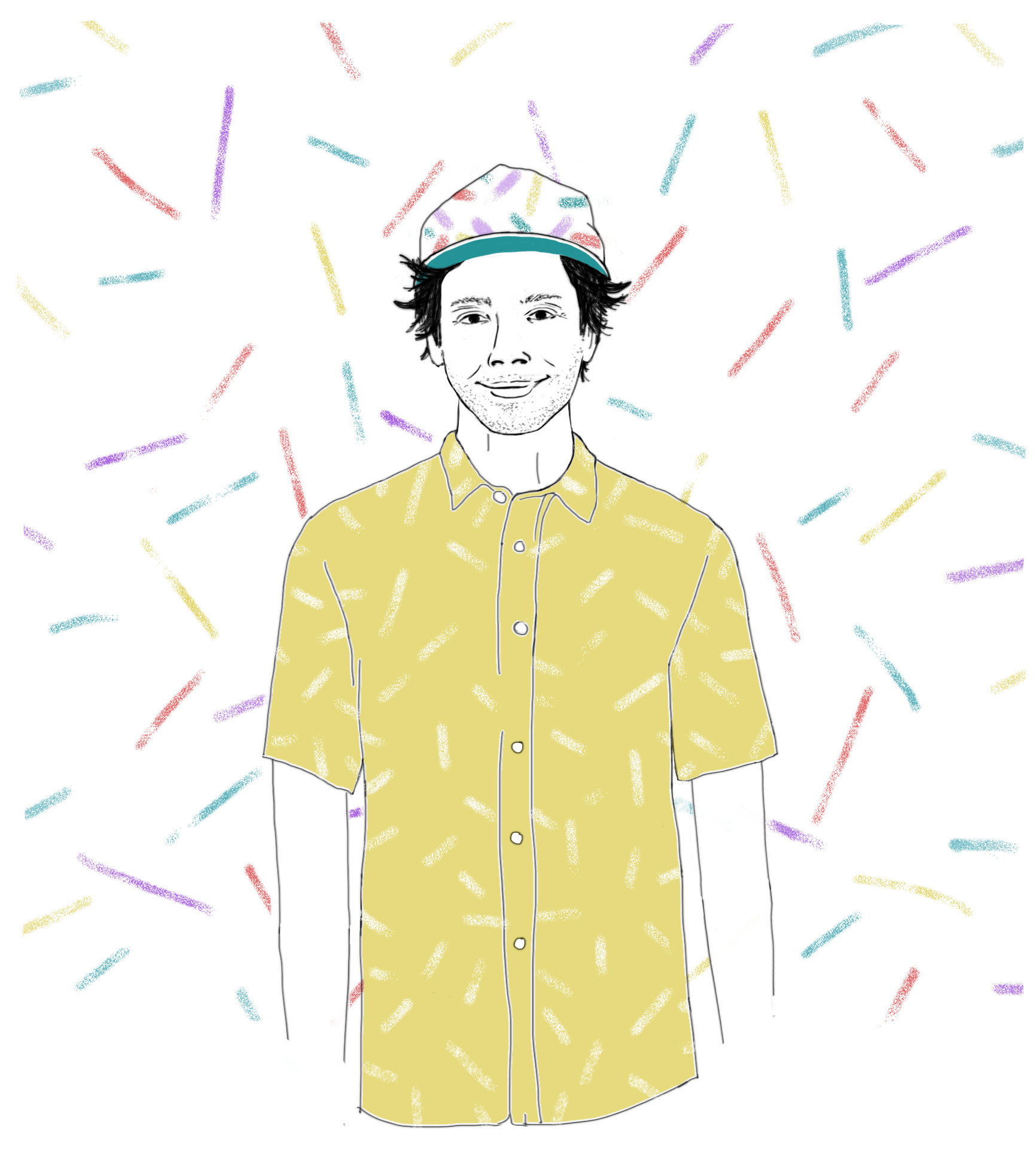
Dylan’s poortrait of Bárbara Fonseca & her partner Diogo
Dylan, thank you so much for introducing me to your illustration practice! To find out more about Dylan’s illustration and design work see his website or contact him at hello@dylantaylor.me