This is our new illustration dissection section, where we take illustration apart, layer by Photoshop layer… No really, this is our new illustration criticism section, where we look at specific illustration work, in context, and evaluate it – how it communicates, how it was created, published or presented. We will be looking at a variety of styles, approaches and media, but will base each critique on the same questions.
Please add your voice! You can add your thoughts or questions in the comments section below, on the Illustrators Illustrated Facebook page, tweet us @illus_illued, or send us a message.
First up, we’re looking at illustrations by Estonian illustrator Eiko Ojala for the article ‘Why are the streets always under construction?‘, by Emily S. Rueb, in the New York Times.
Please read the article and look at the all the illustration work in context!
NY Times article published online at nytimes.com, August 2016.
Critique by Judith Carnaby.
Communication
What is the content, and how does the image communicate the idea or ideas?
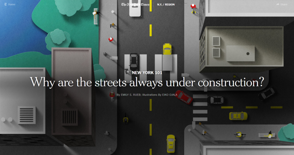
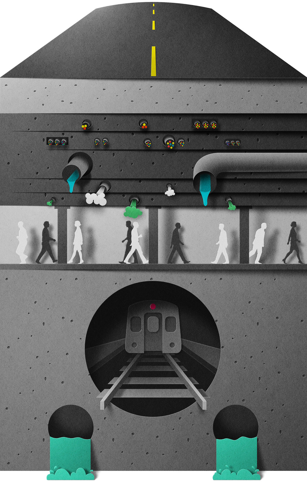
Six illustrations are included as part of a New York Times article exploring NYC’s immense road and subterranean infrastructure, and each illustration works to convey a different idea relating to the text. The opening illustration is similar to the main heading and provides a (literal) overview to the topic of the article: it’s a bird’s eye view of a city and portrays urban infrastructure and city life: streets, rooftops, traffic and pedestrians. As you continue through the article the illustrations communicate different aspects of the city’s infrastructure: a cross-section revealing the complex layers of subterranean tunnels and pipes; signs and symbols that are used to communicate what is below the asphalt; revealing the muddle of conflicting /competing underground infrastructure; depicting a road surface’s wear and tear; and finally, an ideal pot-hole-free road. The illustrations’ combination of paper texture, light and shadow creates a feeling of three-dimensionality which connects you to the descriptions of objects, spaces and places in the article. For me, the illustrations are echoes of model train sets, which adds a sense of playfulness to the article.
Text-image relationship
In what ways does the illustration make the text’s meaning clearer, and/or in what ways does the illustration change the text’s meaning?
The article examines New York City’s infrastructure under the city streets: how it developed, who owns and administrates it, what costs are involved and how it is maintained. While the illustrations connect quite directly to ideas in the main body-text, the illustrations are also followed by short texts that explain, or add to, the illustrations’ visual content. It is a nice interplay between the illustrations and the information in the text; each informs the other. In most cases Ojala’s illustrations are a clear, stylish representation of what is mentioned in the text, but most successful is the cross-section-style illustration detailing the chaotic labyrinth of subterranean tunnels and pipes. This illustration portrays layers of water mains, electricity, steam, gas, trains and sewage in a way that visually expands the text’s descriptions.
Eiko Ojala for the NY Times
Engagement
Does it make you feel something, and does it make you want to engage with the idea/text/information/product/service?
As above, all the illustrations communicate ideas or descriptions in the text, but the cross-section illustration is the stand-out work that really engages your interest and imagination. While the other illustrations are technically impressive and very elegant, they lack an energy or playfulness to really make them pop. In the cross-section illustration, it is the smallest elements that give life to this work: the puffs of steam, the dripping water and the small splashes of sewage. The illustration still conveys information – how the pipes, tunnels and tubes are organised in different layers, and what they transport – but the cross-section structure is something you would never be able to see in a photograph. It sparked me to imagine what could be in the street below me – undoubtedly there is a similarly jumbled mess of pipes and tunnels weaving beneath Berlin’ streets.
Aesthetics, style and tools
What are the techniques, tools, process or systems involved in creating the work? Are they important in communicating the ideas?
The illustrations have been created digitally, rendered to appear as if thick paper or card has been cut, sliced and placed together to form 3D illustrations. The works are created through a mix of digital illustration and paper textures, layered with a combination of real and artificial shadows. Key to the deception of materials is Ojala’s precise use of light and shadow to create depth. Subtle highlights on the edges of the ‘paper’ help make the 3D effect even more realistic. It is a unique technique, and there are few other illustrators working in this way. Many paper artists will create works in paper, photograph them and then edit them digitally, and some 3D and motion artists are working with simulated paper objects, but it appears that Ojala is the first to develop this specificlly digital paper-art style for illustration.
The illustrations are all meticulously executed, and his technique is impressive. The only illustration I where I find his technique a bit problematic is the illustration of the symbols [below]. Ojala has tried to blend ‘paper’ and ‘paint’ to appear as if the symbols are painted on a road’s surface yet are still layers of paper. I feel like he was trying to join two disparate things together, and not quite making it work. Perhaps it could have been better to make it appear as if it was just paint on paper, rather than trying to create a blend of paint and paper that sits strangely both in, and on, the paper asphalt? But then again, perhaps it needs an aspect of three-dimensionality to make the symbols stand out enough?
Using paper-art style illustration was successful approach to the design of the whole article. Reading about smooth roads, rugged potholes or corroded pipes, and then seeing them represented with paper, adds a great feeling of tactility to the article. Although perhaps an artist working with actual paper, with its inevitable flaws, could have enhanced that feeling even more?

Eiko Ojala for the NY Times
Display & Design
How is the work presented, published or displayed, and does that play a role in, or influence the work?
I’m not sure if the article and illustration work was also published in the printed version of the New York Times, but the online version takes advantage of the benefits of digital publishing. The large opening illustration sits under the main heading, filling the full width of the browser. It is a bold, graphic start to the article and leads you down into the text. Utilising the website’s simple contemporary scrolling format, the user scrolls down through the content of the article, where the illustrations are interspersed with the text. The illustrations are placed on equal footing to the text of the article, and sometimes even threatens to overwhelm it: the illustration of symbols [above] fills the width of the browser, dissects the text, and loudly demands you pay attention to it. In the illustrations, tones of grey and black depict concrete and asphalt, and are punctuated with bright yellow road markings, blue and green water and sewage, or red cars, wires or symbols. The text is also designed in blacks and greys, with lines in bright yellow to highlight certain salient points in the article.
While Ojala’s work is a successful part of this article, the adaptability of his digital paper-art technique is better seen in another of his works for the New York Times. This illustration [or see below] for an article about Brazil’s preparation for the recent Olympic games in Rio shows how working purely digitally opens up new territory for paper-art style illustration. Traditional paper-art is undoubtedly skillful, but it’s static. Or, when it is animated, it is time-consuming and finickety. Perhaps this Rio work doesn’t have the ‘charm’ of real-paper animations, but it shows the exciting new opportunities for illustrators who are interested in the aesthetic of paper-art, but want to use digital tools to create work quickly, precisely, and with a lot of freedom to experiment.

Eiko Ojala for the NY Times
Work in context
How does the work sit in relation to contemporary or historical contexts (artistic, stylistic, cultural, social, political etc.), or in the artists own practice?
Paper-cutting and paper-art has a long tradition (from as far back as the 4th Century), and many artists continue to work in the field. Over the last few years paper-art has been a popular trend in advertising, perhaps due to the contemporary fetishisation of anything ‘hand-crafted’. But, this contemporary focus on hand-craft and its echo of the modernist idea of ‘truth to materials’, is being challenged by these works. Ojala’s illustrations are clearly well crafted, and he is peerless in digital paper-art, but what is most exciting is that in working with ‘digital paper’ and creating works tailored for digital media, Ojala’s work utilises all that digital media has to offer and shows new possibilities for paper-art style illustration.
To see more work by Eiko Ojala see his website.
Please get involved with this critique in the comments section below!
Or, if you have any suggestions for critiques or want to critique an illustration yourself, just get in touch.
I don’t believe it is just me, but I see so very little art being used that requires the ability to actually draw and paint well. Is the field of illustration moved beyond that or are the people who buy artwork today not interested or uninformed to that type of illustration. Also, back when I was a full time illustrator 1970s and 1980-90s, basically 30 years, there was a lot of interesting assignments and they paid well enough that you could actually live on your earnings. Today, I doubt that there is enough work out there nor will it pay enough to maintain the illustrator. I feel the industry is not valued by the the new so called art directors, a photo is better. There is a lot of photo manipulation being used. Basically, most of what I see today leaves me bored and I find most of it uninteresting. Maybe the illustration field today loves it and thinks it’s the cats ass. Look at what Mark English, Bernie Fuchs and Tom Lovel did over the years just to name a few did.